Immunofluorescence
OK here's a post geared mostly to cell biologists. My big pet peeve about reading the scientific literature is ... colored fluorescent images.
Why do people insist on pseudo-coloring their images? I know that you want pretty pictures and as every kid knows the more colorful the picture the more adoration one gets from approving parents ... but we're talking about data and instructing/convincing your fellow peers about new findings.
So why is color bad for data presentation?
- Your eye is better at detecting various shades of grey than shades of any hue. Or to rephrase, it's easier to detect details in a black & white image.
- Your eye can also simultaneously detect many more shades of grey than any hue. This is sometimes called dynamic range. If your protein is enriched in one area of the cell and sparse in another location, it's easier to convey the range of concentrations in black & white.
- Then there is the famous green/red overlays. I hate those! You can never tell whether an area is green (just protein 1) or yellow (protein 1 & 2).
So let me illustrate (literally!) what I mean:
Here is the same image (of a protein localized to the endoplasmic reticulum) in black white, and the 3 colors commonly used: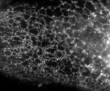
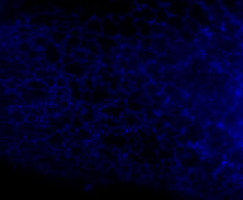


You're thinking, well it isn't so bad ... but in a journal article these images are usually scaled down ... lets do that.
Besides the blue pic, they're still not too shabby ... but go ahead and print these 4 images and all detail will be lost in the red and blue images. Greens tend to fair a bit better, but the black and white will be just fine and clear. Yes clarity is the aim of data presentation, not pretty pictures.
posted by apalazzo at 8:55 AM
![]()
![]()


<< Home